ACSS 4 Sections — 2 col
Two-column banners built on one composable .split component. ACSS 4 ships no grid or gap utilities, so the column structure is a house chip — but every value inside it comes from an ACSS token. Each banner below names the variant it demonstrates.
Default
Bare .split — 50 / 50
With no ratio modifier the columns are even. Content sits left, media right, and the media bleeds to the viewport edge. This is the baseline every other variant modifies.
Learn more
Inverse
Bare .split — 50 / 50
The same 50 / 50 bare .split, mirrored: the media sits in the left column and bleeds to the left viewport edge, content on the right. Placed under the default so both bleed corners can be compared.
Learn moreRatio
.split--42-58 — narrow content
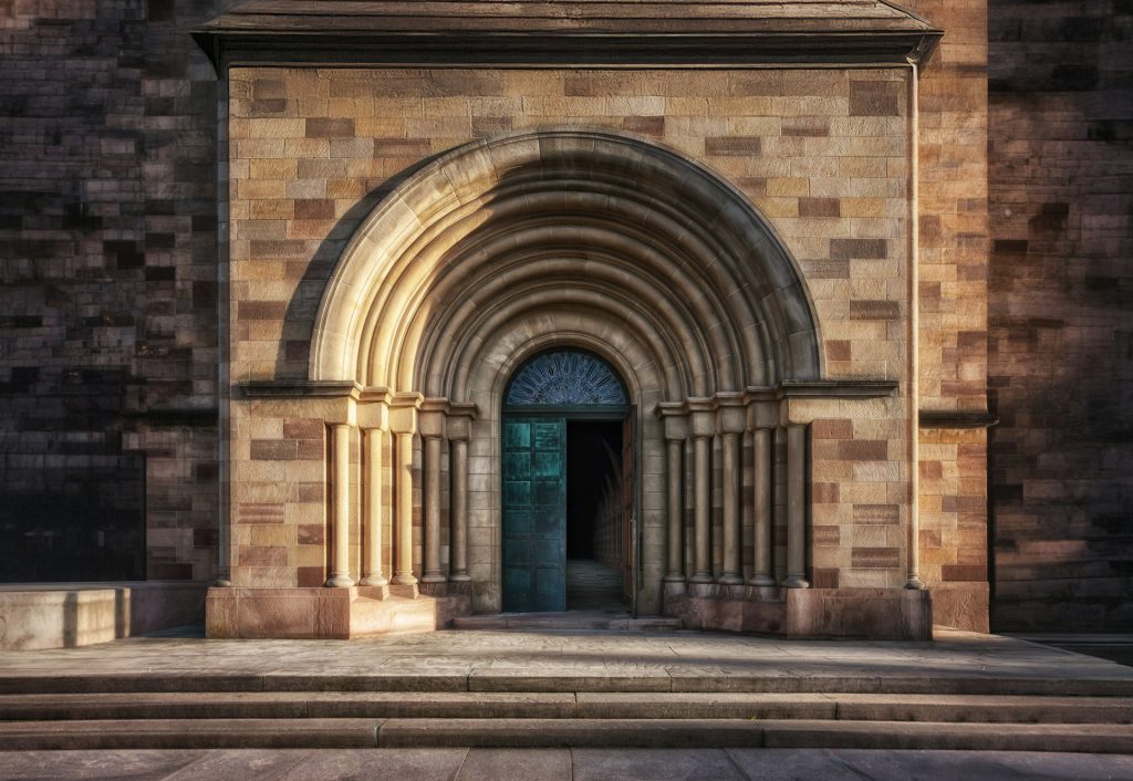
Adds one custom property. The modifier sets --split-ratio and nothing else, so a new ratio costs a single line rather than a duplicated media query.
Ratio
.split--58-42 — wide content
The inverse ratio, for banners carrying more copy than image. Same base chip, same breakpoint, one different token.
Learn more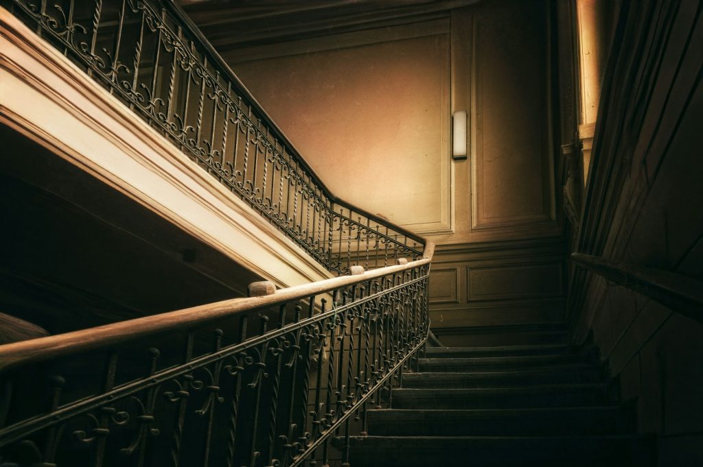
Order
Media on the left
The media column takes .split__media--left and the content takes .split__content--right. Both are one-line modifiers; the column assignment is a custom property, not a duplicated rule.

Treatment
Contained media
The .split__media--contained modifier cancels the edge bleed and rounds the corners using --radius-l. The modifier only overrides --split-media-bleed, so it never fights the base chip on specificity. It also adds block-axis space, so the rounded corners read as a card rather than a slab.
Ground
On a dark band
The band is pure ACSS: .bg--ultra-dark on the section and .text--light on the copy. The split component is unchanged — backgrounds are never its business.
Ground
On a muted band
The same component on .bg--ultra-light. Alternating grounds is how a page of banners gets rhythm without any new structural CSS.
Alignment
Left-aligned on mobile
Every banner above carries .center-mobile, which centres the copy below 768px. This one omits it, so the text stays left-aligned at every width. Narrow your window to see the difference.
Structure
Two content columns
Nothing requires the second column to be media. Two .split__content children give a balanced text banner with no extra chip.
Pairing
The second column
Heading level drops to h3 here because this column sits under the banner’s h2 in the outline, not beside it. Level tracks depth, never size.
Default Hero — Side Image Right
A two-column hero with the image on the right.
An asymmetric grid (42/58 on desktop) places the content column on the left and a full-bleed media column on the right that breaks past the container edge. The triangle pseudo-element on the figure provides the signature visual transition between the two columns. Media that needs to spill a little into the copy — a transparent PNG or SVG — can opt in with .split__media--overhang; photographic media like this omits it, so nothing covers the text.
Flipped Hero — Side Image Left
The mirrored variant — image left, content right.
Same asymmetric grid pattern (now 58/42), but flipped. The content column sits on the right and the media column breaks left past the container edge. The triangle pseudo-element points right-to-left to mirror the visual direction.
Primary Button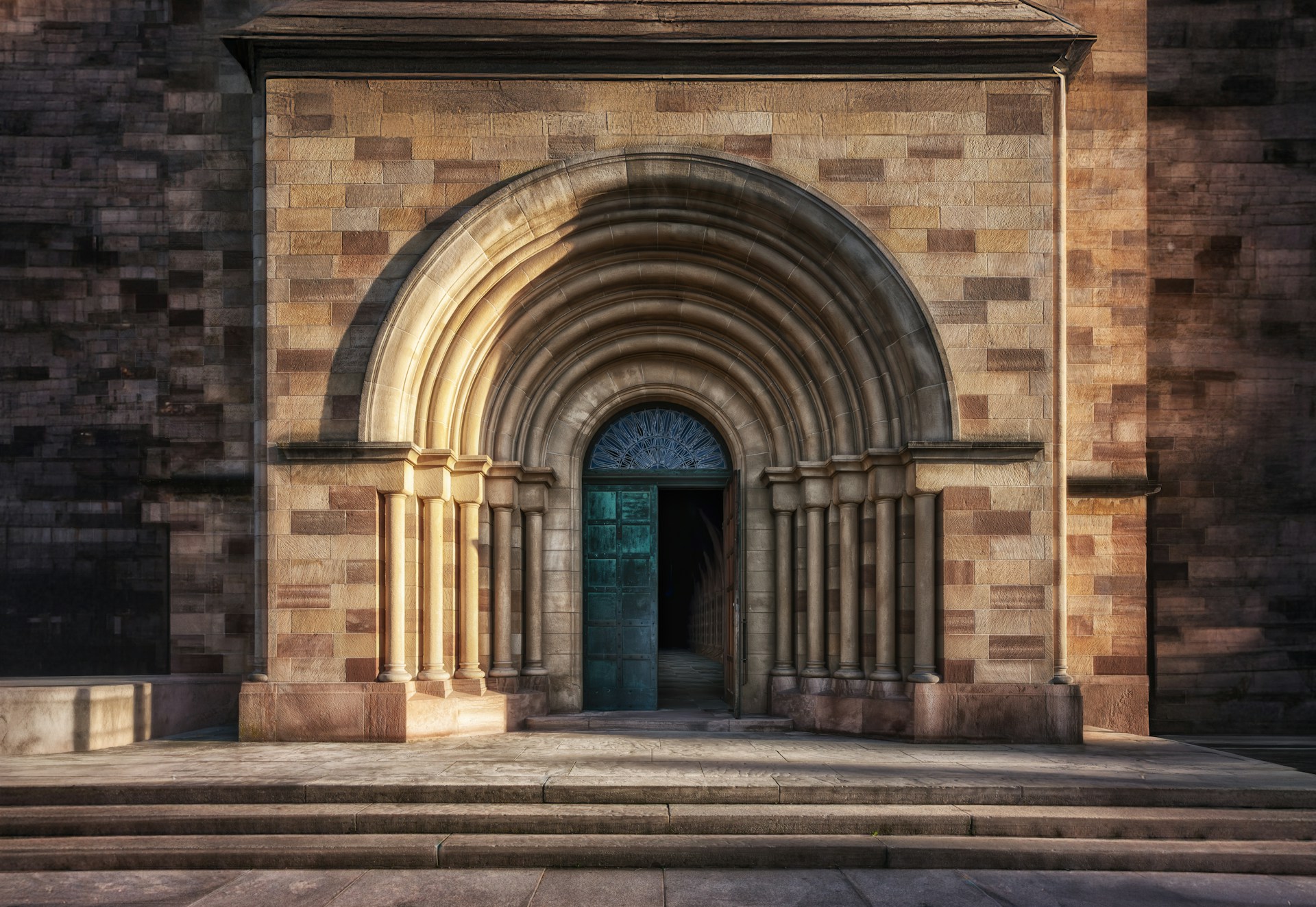
Overlay
Basic overlay on the media column
The same .overlay class, this time on the <figure> rather than the section. ACSS detects a figure wrapping media and flips --overlay-z-index to 0, so the tint paints above the image instead of behind it — no z-index bookkeeping needed.
Overlay
A brand tint over media
.overlay--brand composes with the media modifiers rather than replacing them. This figure is tinted, and the column it sits in is still an ordinary .split__media.
Overlay
A scrim on contained media
The gradient scrim over a rounded, contained figure. Overlay, radius and column ratio are three separate concerns here — none of them knows about the others.